Anyone seen the paper? A Pitchup.com ad campaign and a big fat facelift
Anyone seen the paper?
Coo, what a week the last one has been. (We'd sit down and fan ourselves, but we're far too busy for faff like that: we've just added our first site in Peru. That's country number 26 for us, travelling types!)
Busy bees Part the First

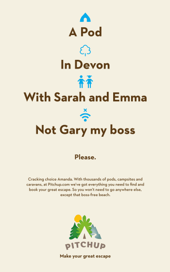
If you've picked up the Mirror, Metro Travel, the Birmingham Mail and a few others today, you may have spotted the creation just to your right – Pitchup's first ever newspaper ad.
We've been working on these for the past couple of months with our agency searching deep into the very depths of our collective creative souls for how best to sum up what we do. Should we focus on the splendiferous range of accommodation we offer? Our ever-increasing country list? (26!) Outdoor hols as a whole?
But then! We pondered exactly what we do that no one else does – and that's helping people tailormake the exact hol for them, whether that's a campsite in Cornwall, family friendly and near a beach; a yurt in a forest and with campfires allowed; a pod in Scotland near a pub; a lodge in Dorset surrounded by nature... And hundreds more, but we'll run out of space.
We like that you lot all have different ideas about what you want on holiday, from the standard couple of summer weeks away with the kids to breaks of the more eccentric kind. So we don't want to narrow what we offer into one particular type of break when we have as many types of holidays to mix and match as customers who want to mix and match them. Each to their own. Man.
Hence: ad. Have a look out for them today in the newspapers above as well on Facebook, in the Coventry Telegraph and the West Midlands Express and Star, in the Sun on Tuesday and in national and local papers over the next couple of months. Tweet us a pic if you see them – we're mighty chuffed.
Busy bees Part the Second

Have you also noticed we've had a facelift? Yep, after almost six years we've changed the Pitchup.com logo and it's now on the homepage and on our social media. This is just the first part of our process as we overhaul the site in a full-on facelift due to happen over the next few months: we think the phrase is 'watch this space'.
There was quite a bit of chat about this one too. Like in our ads, we wanted to show the variety of countryside landscapes our sites are in, as well as change our colours from green and brown, update the typeface and overall make the logo look a lot more purty. On top of that, we wanted to show we're now a global company, and the logo had to be something that would look handsome on our social media pages too. No pressure, then.
We decided a hand-drawn image was the most Pitchuppy way to go and we're mighty chuffed with how it's all turned out. As we say, this is just the start of a major facelift on the site: we'll keep you posted with what's happening next.
We're off to look at the papers again. Preen.
